Case study 06 / 07 ⸺ CashLambert.com ⸺ 2026
Stories That Inspire.
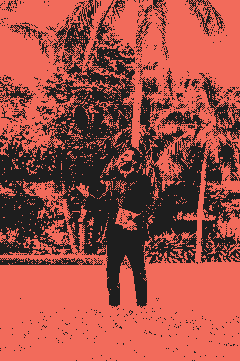
Cash has three books out and a fourth on the way, but his website showed just one and kept his blog near the bottom. I redesigned it as an author site with a page for every book, the blog up front, and a CMS he can run himself. His reaction: “this is the coolest thing I’ve seen.”

§ 01
One book on stage.
I built Cash's first website on Squarespace about five years ago. Back then it had one job: show off one surf book. Since then he's published Surf Therapy, which won the Surf Park Summit's "Democratization and Accessibility" award, and Changing the Playbook with Bloomsbury. A fourth book is on the way.
The site hadn't changed with him. It was still one long page with a surf-themed hero, and the new book isn't about surfing. Twenty-one posts about press, events and interviews were buried below the fold, and the template had no room for a Books menu with a page per book.
“I just want the website to communicate the growing list of books and right now it’s structured in a way that just shows one.”
*Cash, in his brief
§ 02
Structure first.
Cash wanted a Books menu with a page per book, a blog people could find, a hero built on his new photos, and a palette that leaned into football. He'd write the words. He needed structure and design.
Before any design, I mapped every old URL to its new home and moved all 21 posts and 78 images off Squarespace. Then I set the content up in a CMS (Sanity) written in plain English, so he can publish without me.
§ 03
Four directions.
I mocked up four homepages: Under the Lights, Paperback, The Shelf and Front Page. None of them shipped as drawn.
The final site took a piece from each: the condensed caps, the numbered row of books, the brown band for the latest release, and the football laces.
A · Under the Lights, B · Paperback, C · The Shelf, D · Front Page
§ 04
Built like a game program.
Cash asked for football, so the palette is football brown, near-black and warm beiges, with a signature orange. Yellow, brown and orange bands mark the big sections.
For type I set 12 free condensed faces side by side in the site's real headlines. Big Shoulders Display won, in all caps, because it reads like stadium signage. Manrope handles the text and DM Mono the labels.
§ 05
Every book gets a page.
The homepage now runs hero, His Work (the books, on yellow), latest book (on brown), blog, About and Contact. That's Cash's order, with the books added up top so they're the first thing you reach.
Each book has its own page: cover, description, buy links, praise, "On the road" photos from signings, and links to his other books. Blog posts open their galleries in a lightbox and end with a card for the book they're about.
On a phone: a book page, a post gallery and the lightbox.
§ 06
The small stuff.
The footer ends with a giant outlined "CASH" that fades into the divider. Soft glows rise from the bottom of the brown and orange bands. And if you hit a broken link, the 404 page says "Fumble on the play."
§ 07
Built to be found.
Every page has search and sharing tags, and each book uses its cover as its share image. Structured data tells search engines who Cash is, what he's written and what he's posted. Every changed URL from the old site redirects to its new home.
When Cash hits Publish, the site rebuilds itself in a couple of minutes. The pages are static and use no heavy libraries, so they load fast, even the one with the intro.
- Pages 31
- Posts migrated 21
- Images with written alt text 78
- Images left on Squarespace 0
- Lighthouse performance, mobile 92–100
- Lighthouse SEO and Best Practices 100
“This is amazing! Oh my gosh! It’s insane, this is the coolest thing I’ve seen.”
*Cash Lambert
§ 08
Ready for book four.
He followed it with “Yeah man! This is the sickest thing I’ve seen, I’m so stoked.”
The next test comes when book four is ready. Cash should be able to add a cover, a description and some buy links in the Studio, hit Publish, and see a new book page and a new card on his homepage a couple of minutes later. No redesign, and no call to me.
See it live.
Visit cashlambert.com